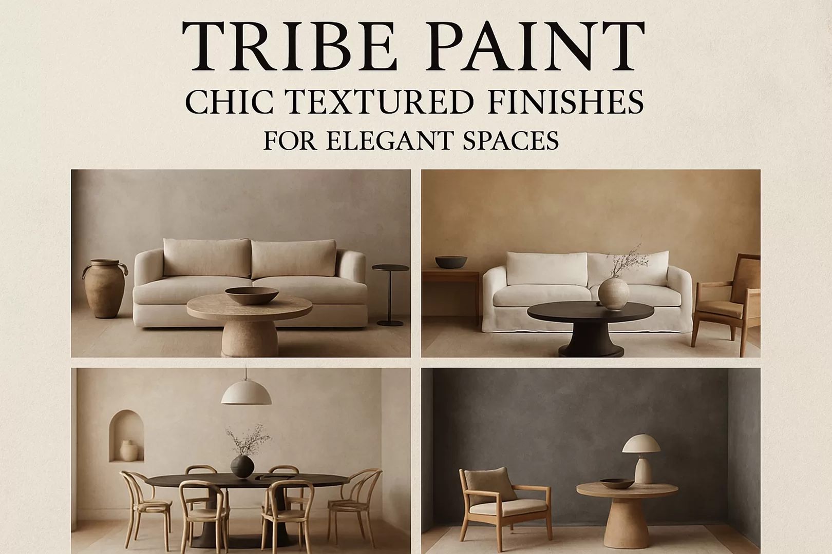
BLOG
Creating Beautiful Spaces

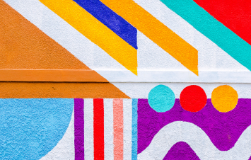
Colours are at the very heart of decoration and combining them correctly can bring balance to a space. But how can you combine colours without making any mistakes? The colour wheel can be of great help. It’s essential to know how to juggle different colours, their saturation, and their brightness in the right proportions.
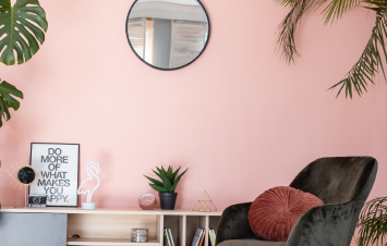
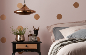
Colours have an influence on our mood and have psychosensory effects on each of us. Warm colours, cool colours, neutral tones… In a room, colours create an atmosphere that will determine how we use it.
WARM COLORS

In the colour wheel, warm shades occupy the half opposite of cool tones. They include all variations of red, yellow, and orange, as well as all shades obtained by mixing these three colours. Warm and cool colours are grouped into two categories, each affecting human behaviour. Some effects are even noticeable at a physical level. Warm shades are known to increase adrenaline levels, blood pressure, and body temperature.
COOL COLORS

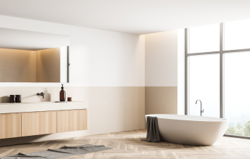
These are the colours of calmness and serenity. Their soothing properties make them ideal in rooms where we recharge. Using cool colours in a small room can make it appear larger and create a sense of space. These tones are perfect for narrow spaces such as entryways, hallways, restrooms, or bathrooms. Furthermore, their calming and relaxing power makes them allies for bedrooms.
NEUTRAL COLORS

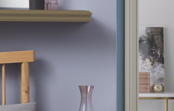
From white to black and beige to brown, neutral tones serve as both connections and transitions when creating colour harmonies. White, grey, and beige remain timeless and safe choices: dull when used alone, they highlight any shades they are combined with. Similarly, black, the symbol of ultimate elegance, is an excellent colour to showcase contrasts. The colours associated with brown, the symbol of the Earth, will determine the room’s style.
Blog


Looking for inspiration or help to bring your project to life? Write to us!
